Research
UX AUDIT
In this reseach process, I used a UX audit to identify issues and collect insights on the Little Skoolz website. I used this method because a UX Audit is one of the best ways to create a clear action plan to improve key product metrics and enhance the experience. There is a certain part in the life of every product where there is a rush to get the features out. (www.headway.io)
1.
Understanding Business Objective
In the context of the UX audit, my initial step was to understand Little Skoolz's business objectives. Through interviews with the CEO, COO, and the IT team. The primary objective identified is to increase program registrations, including both direct payments and inquiries for further information. Additionally, Little Skoolz aims to establish collaborations with other companies and schools.
2.
Desk Research
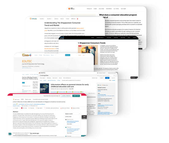
To validate certain information and gain deeper insights into the habits and decision-making processes of potential users in Singapore, I conducted desk research. The objective was to enhance the design solutions that were developed.
Therefore, the UX audit will concentrate on achieving these business objectives by improving accessibility, program information, and the overall user experience.
3.
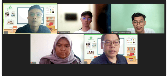
Heuristic Evaluation
Heuristic evaluation is based on a set of usability heuristics or principles, as established, for instance, by Jakob Nielsen.
Heuristic evaluation involves expert evaluators systematically examining the interface based on a set of established usability principles or heuristics. The evaluation is conducted by experts who assess the application against predefined criteria. I conducted a heuristic evaluation with two UI/UX Designers from Little Skoolz. Here are the evaluation results:
4.
Competitive Analysis
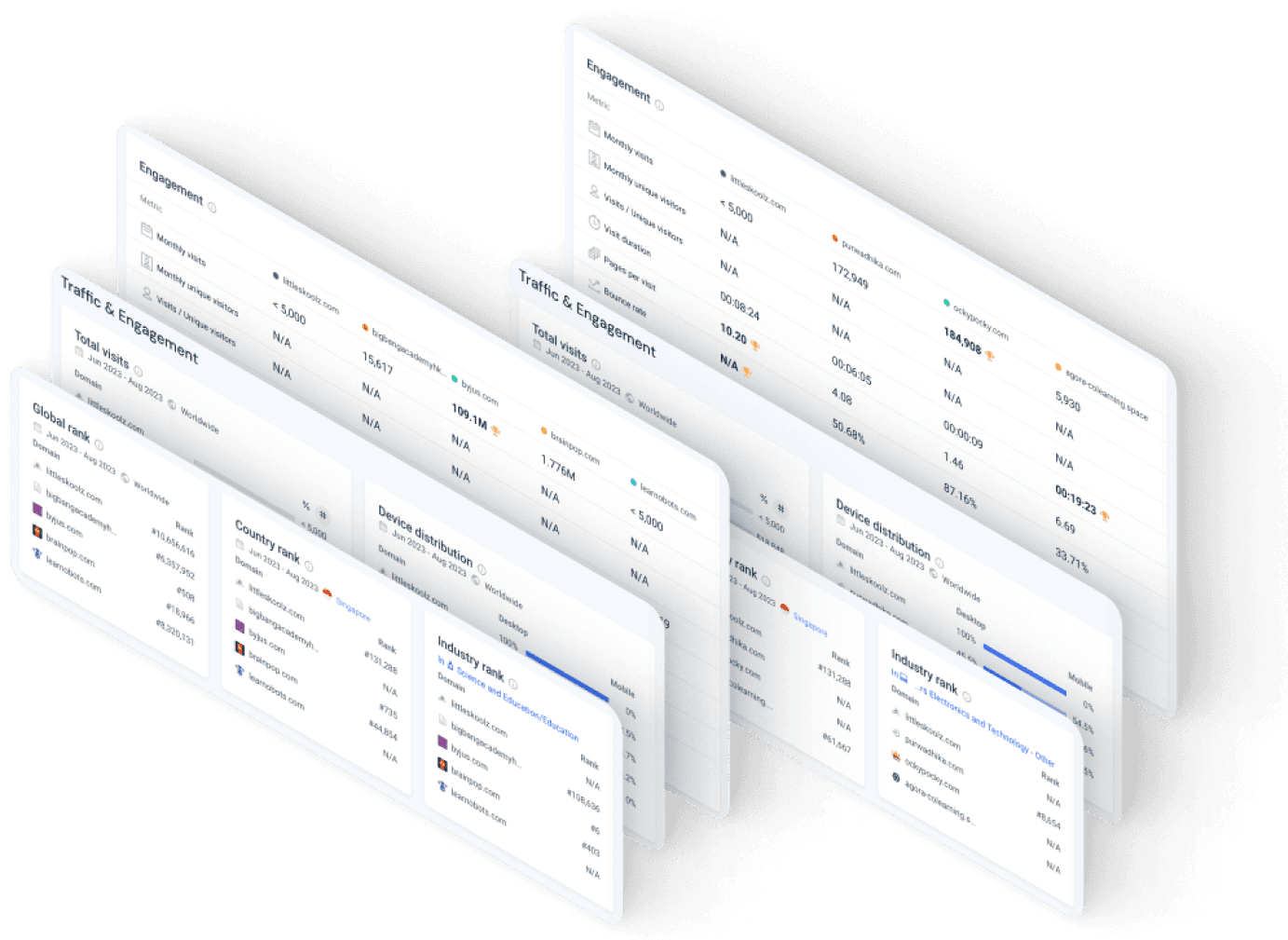
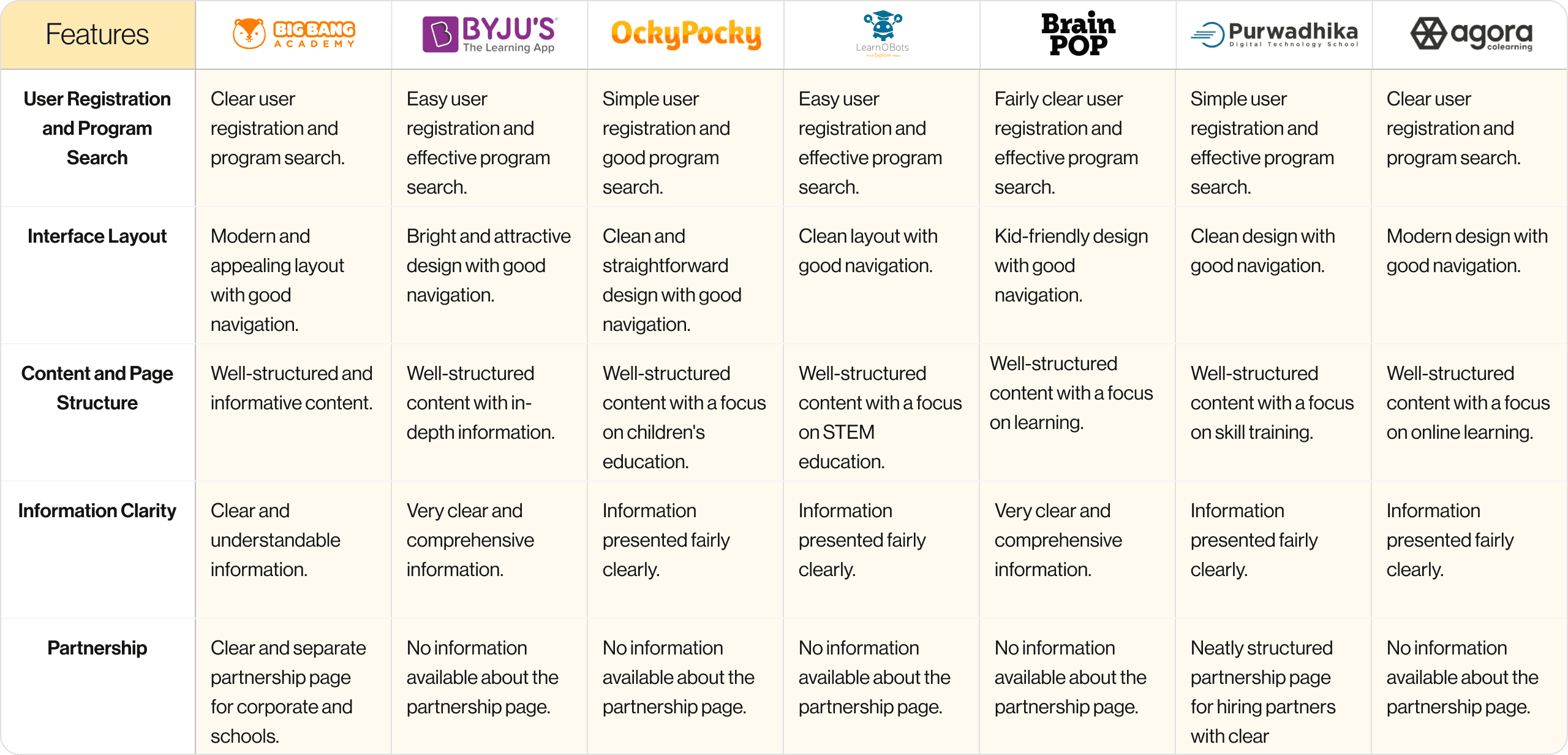
In this phase, I performed a competitive analysis by evaluating Little Skoolz alongside seven key competitors in the educational website domain. Before assessing features and design elements, I conducted an in-depth analysis of these competitors' website traffic and user engagement metrics.
This step aimed to identify robust reference points for guiding the subsequent design development process. The data-driven selection process ensured that the chosen competitors serve as valuable benchmarks for informing Little Skoolz's design strategy.
Ideation
1.
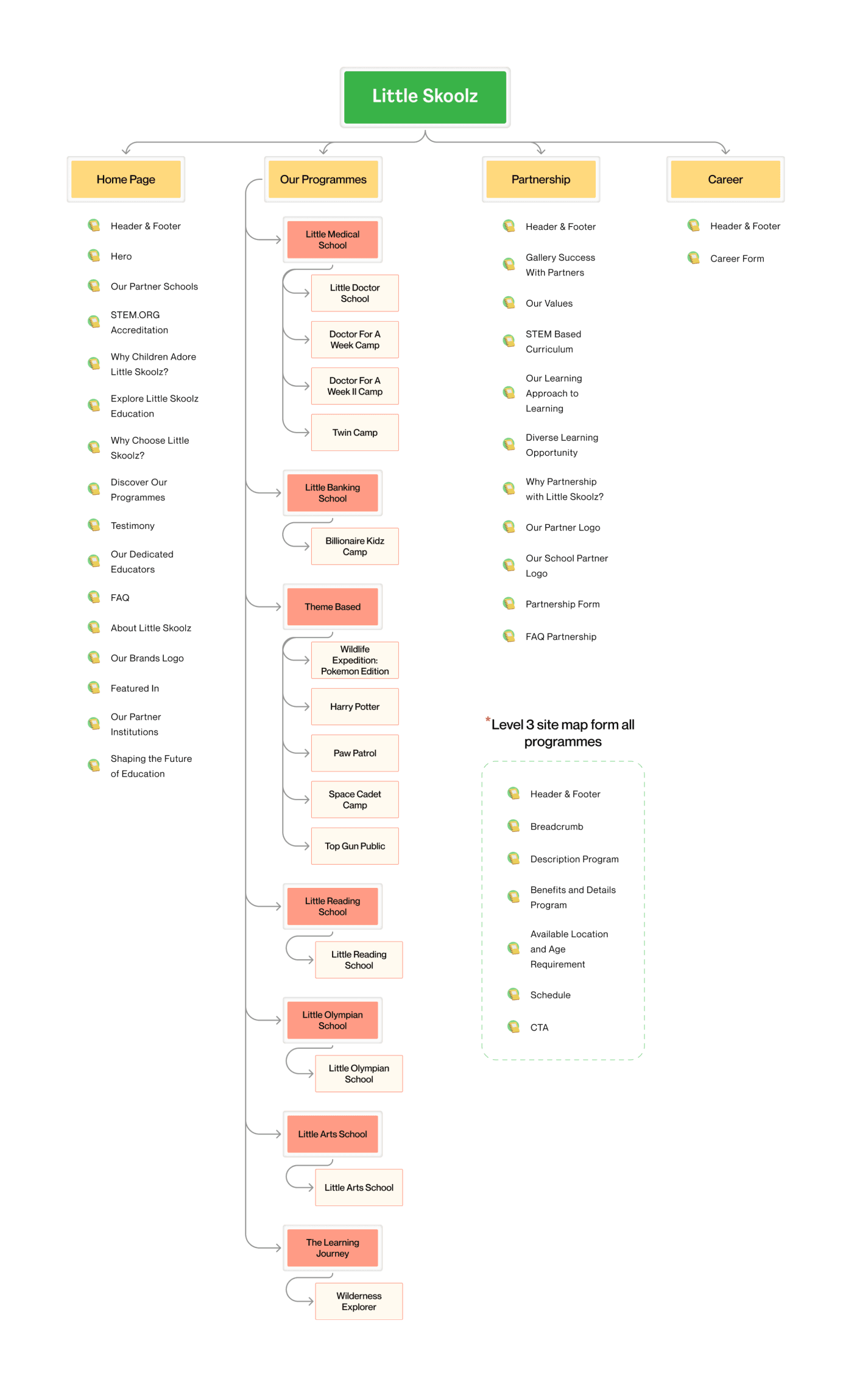
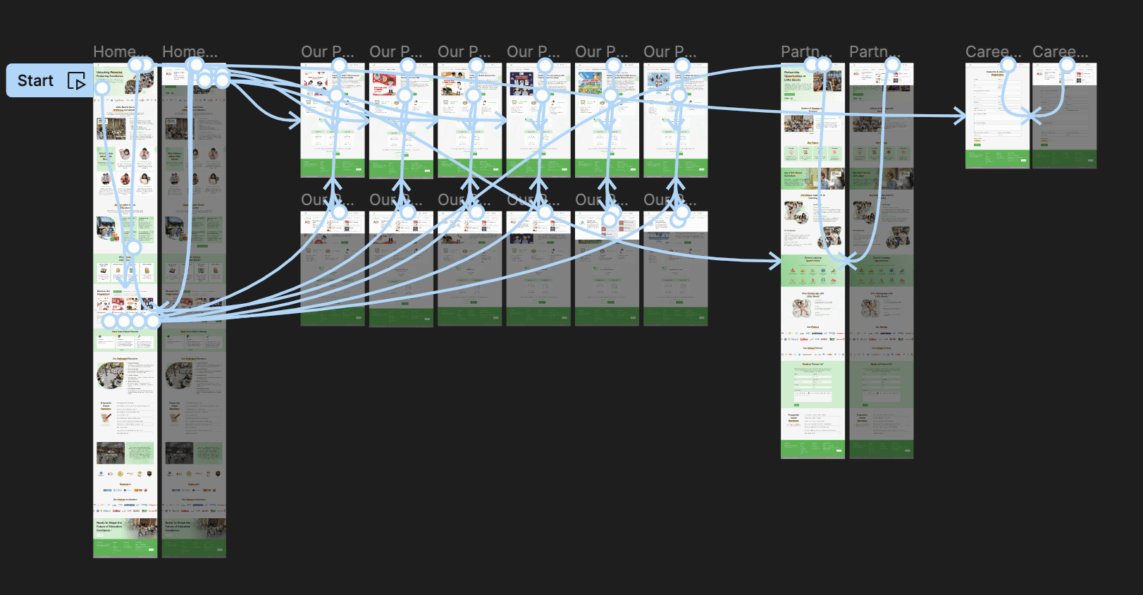
Sitemap
2.
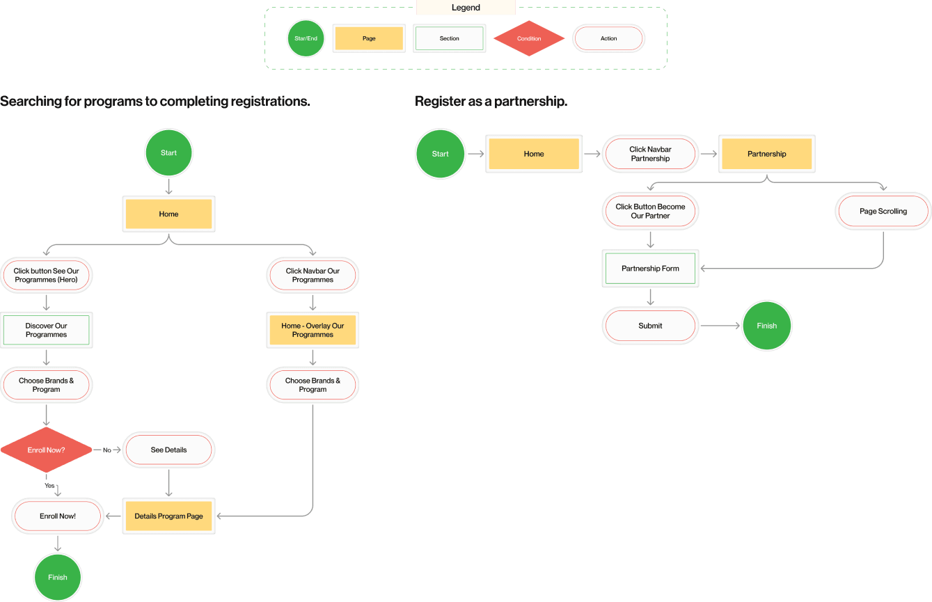
User Flow
UI Style Guide
1.
Typoghraphy
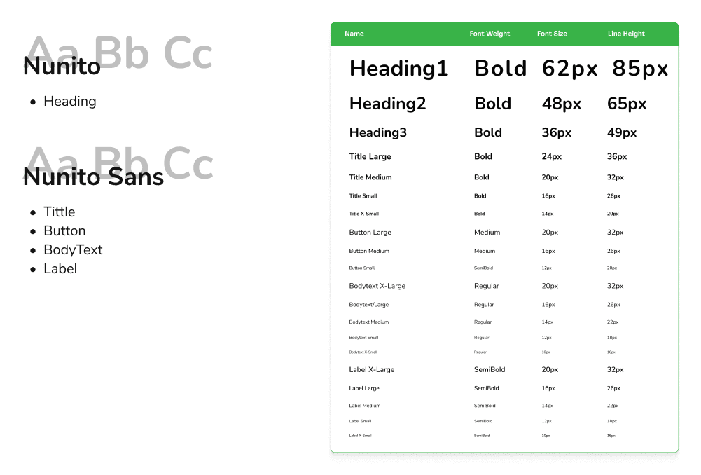
2.
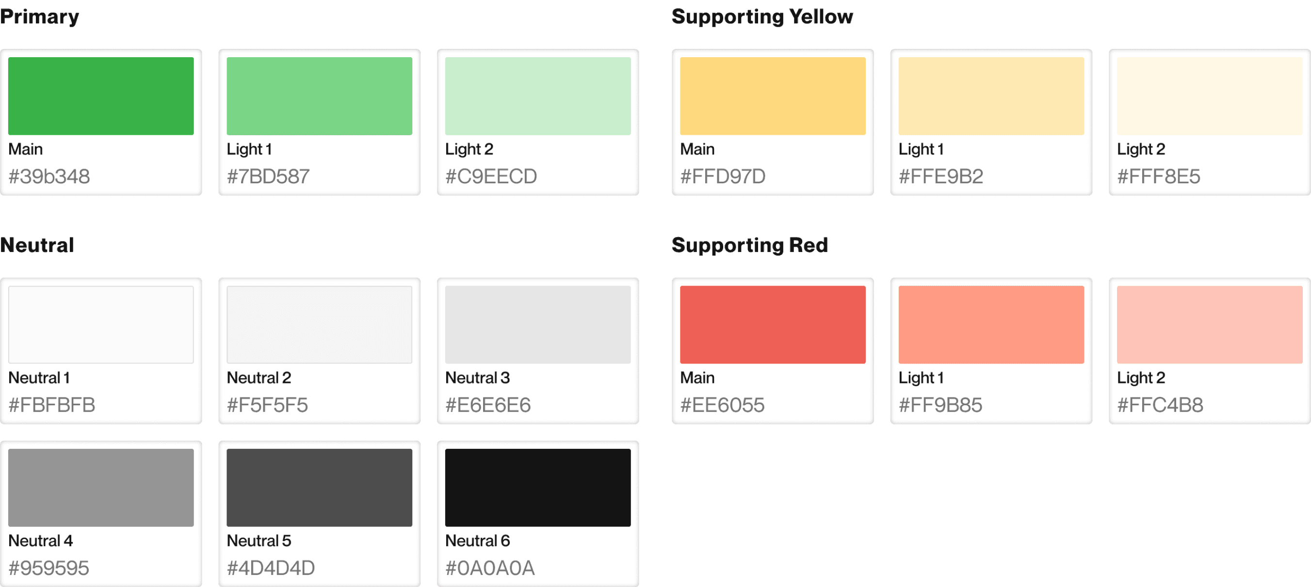
Color Palette
I employed Little Skoolz's primary branding color, which is green (#39b348), and adjusted it by increasing its lightness using HSL.
Additionally, I incorporated the base colors of yellow and red from the color wheel, aligning with Little Skoolz's brand color palette.
Design Solution
1.
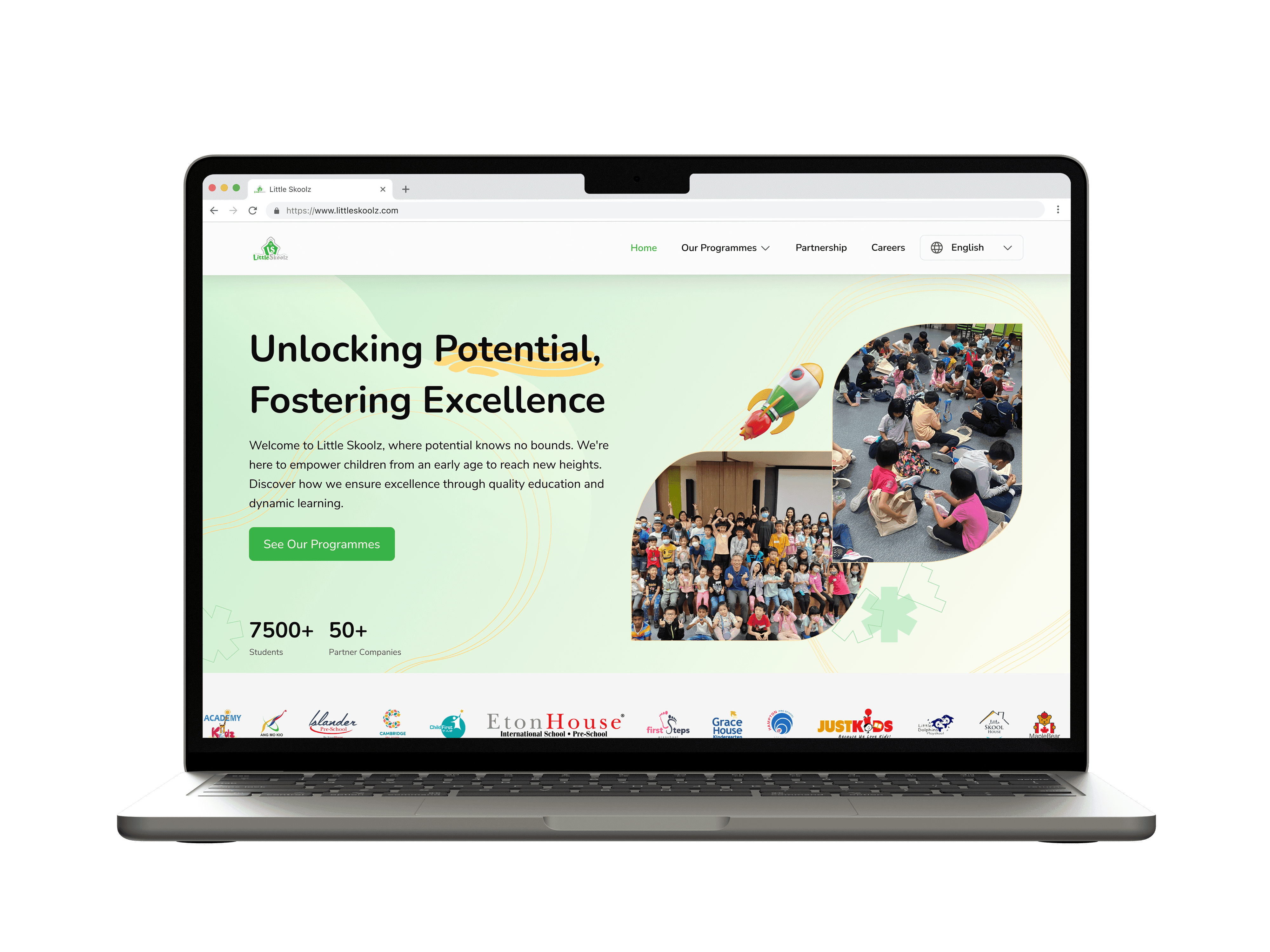
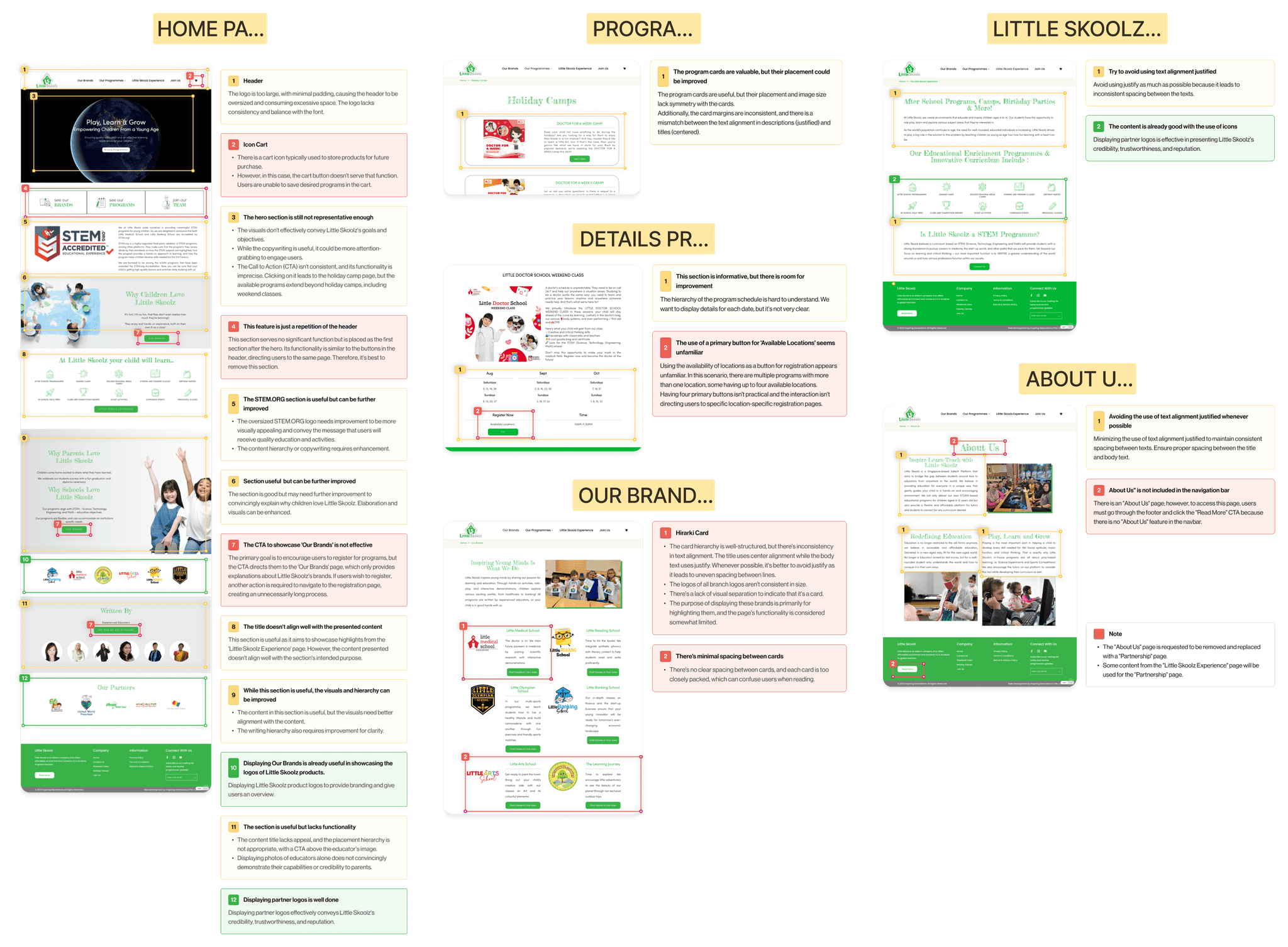
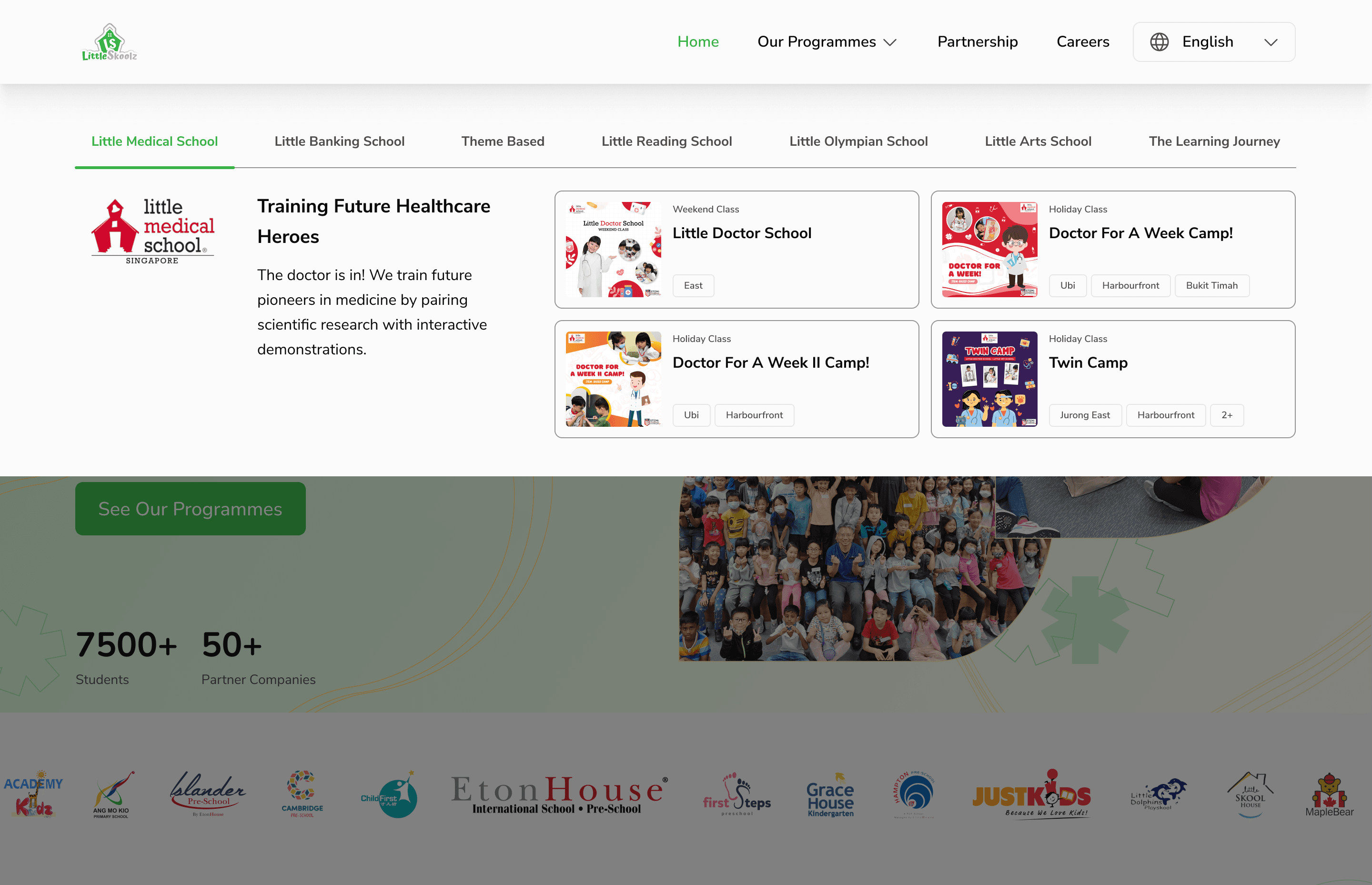
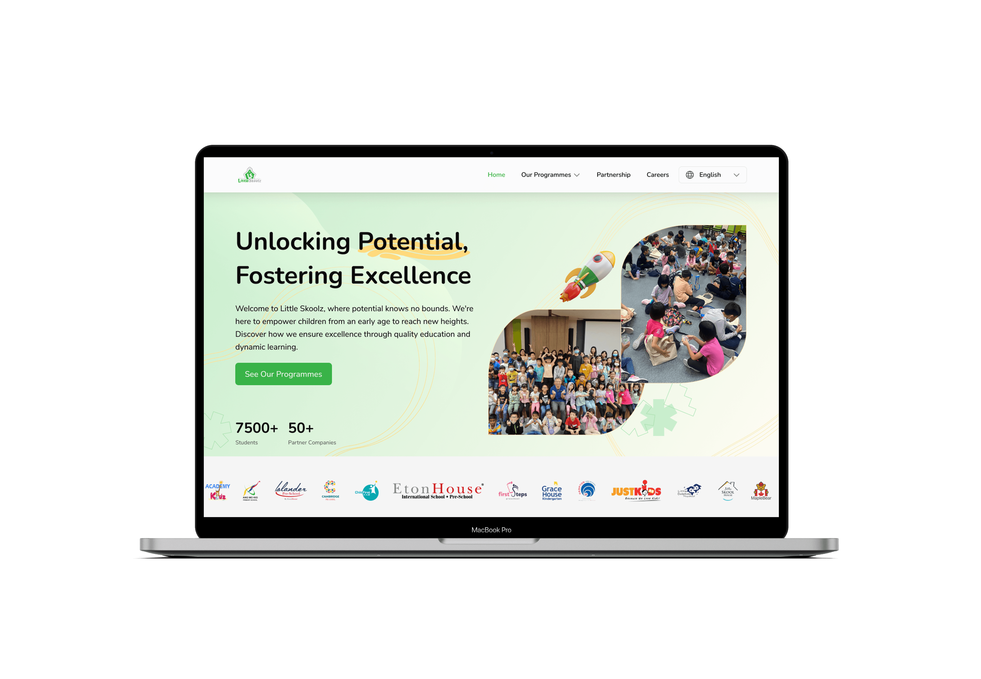
Home Page
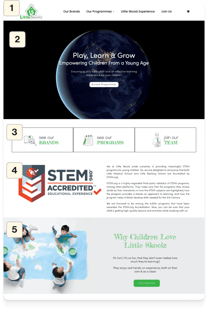
Before
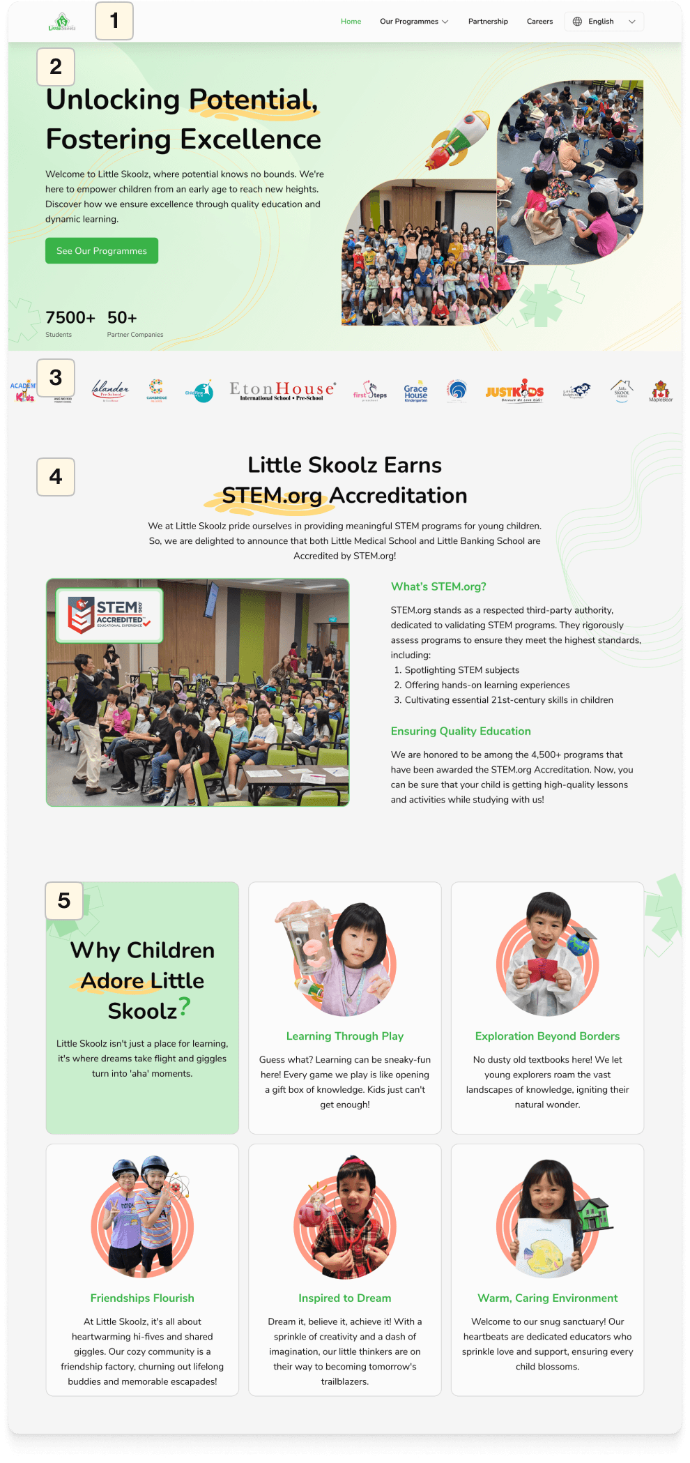
After
1
Header
Make the logo and navigation bar in the header consistent, with a smaller logo.
Add color to the active navigation item to indicate which page is currently being viewed.
2
Hero
Revise the copywriting in the header to make it more engaging and representative of Little Skoolz.
Incorporate images that showcase activities with the addition of 3D illustrations for added visual appeal.
Integrate social proof to build trust with users.
3
Schools Partners
Remove the features "See Our Brands," "See Our Programmes," and "Join Our Team" as they serve the same purpose as the navbar. Replace them with icons representing school partnerships to build trust.
4
STEM.org Accreditation
Create an easily readable hierarchy as it was previously heavy on text.
Modify the appearance of images by adding images of ongoing activities to present its accreditation.
5
Why Cildren Adore Little Skoolz?
Elaborate on the content by delving into the key benefits of the Little Skoolz program.
Replace regular paragraphs with cards displaying more attractive images.
Before
After
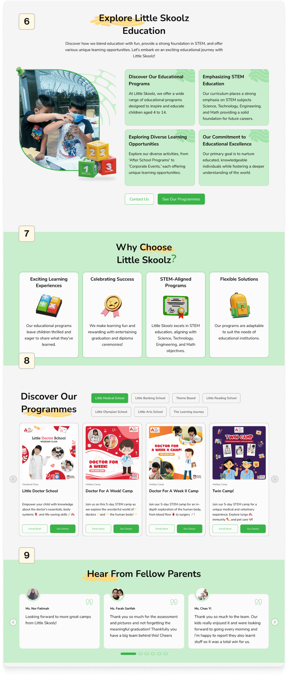
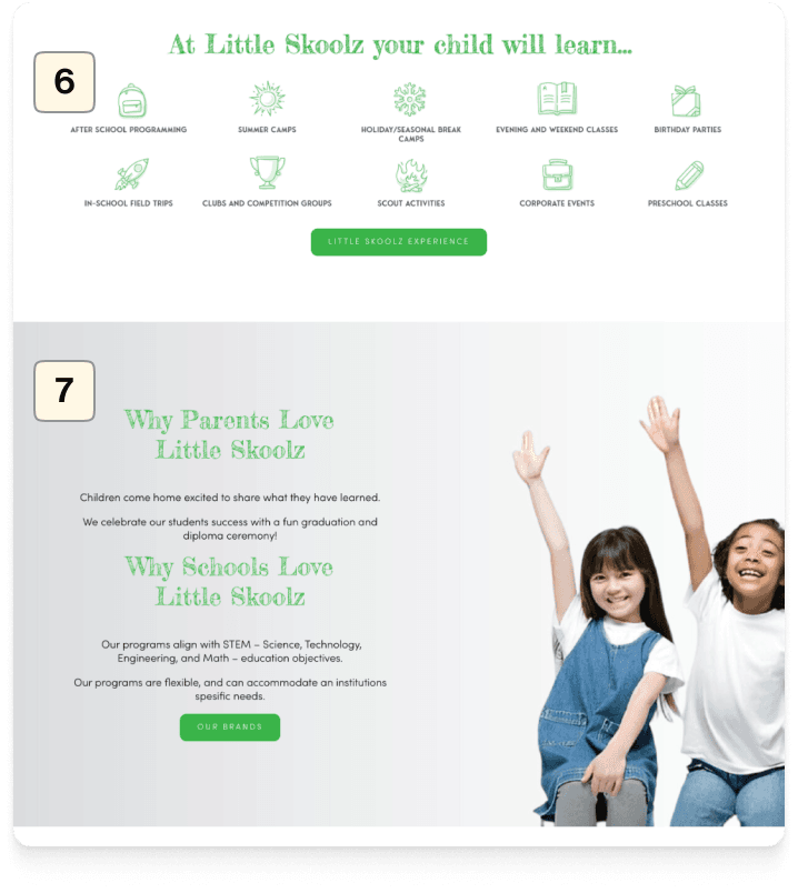
6
Summarize the content from the Little Skoolz Experience Page
Change this section to "Explore Little Skoolz Education" to elaborate on the points presented on the "Little Skoolz Experience" page, which has been removed. Therefore, I am displaying it on the homepage.
7
Changing the appearance and hierarchy
Changing the titles because, in the previous design, there were two titles within one section with poor hierarchy. Hence, we created it with bullet-point cards for better readability.
8
Adding the "Discover Our Programmes" feature
Adding the 'Discover Our Programmes' section to the home page for improved user program search.
9
Adding a 'Testimony' section.
Adding the 'Testimony' section was not present in the previous website. Including this section can instill trust in users when it comes to choosing Little Skoolz programs.
Before
After
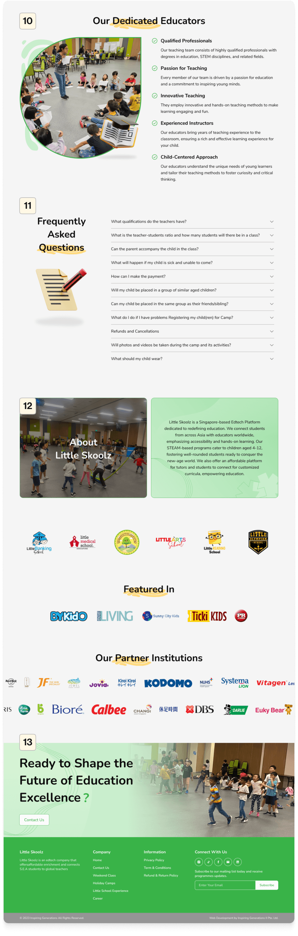
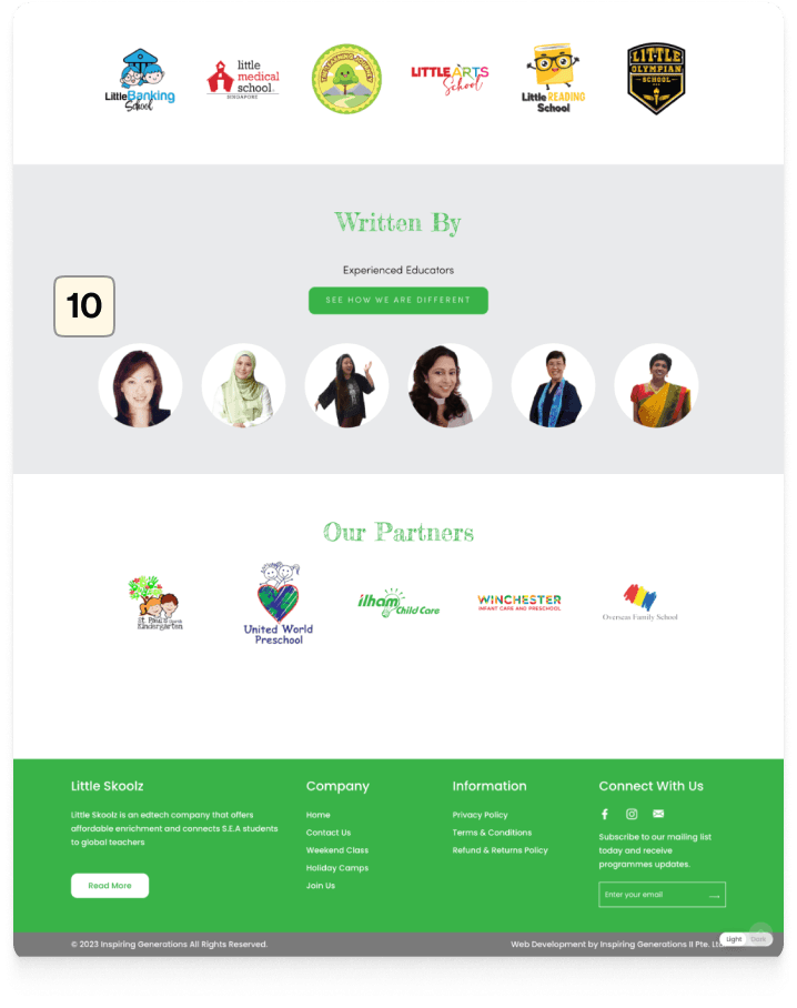
10
Modifying the 'Written By' section
Transforming the Section into 'Our Dedicated Educators,' showcasing points about educators' credibility to enhance trust among parents.
11
Adding FAQ section
Introducing this section to facilitate users with frequently asked questions, following a common pattern widely used on corporate websites.
12
Adding About Us section
Since the 'About Us' page is set to be removed, I've provided a brief overview of Little Skoolz's profile in this section.
13
Adding the 'Ready to Shape the Future' section
Concluding with a section to prompt users for inquiries and encourage them to contact our team directly.
2.
Our Programmes Page
In the ideation and design solution phase for the 'Our Programmes' and 'Our Brands' pages, I crafted two alternative design and flow solutions for presentation to the CEO. This decision was made following discussions with the IT team and the CEO during the research phase. Little Skoolz aimed to present the 'Our Brands' page similar to the previous website.
Alternative-1
Before
After
1
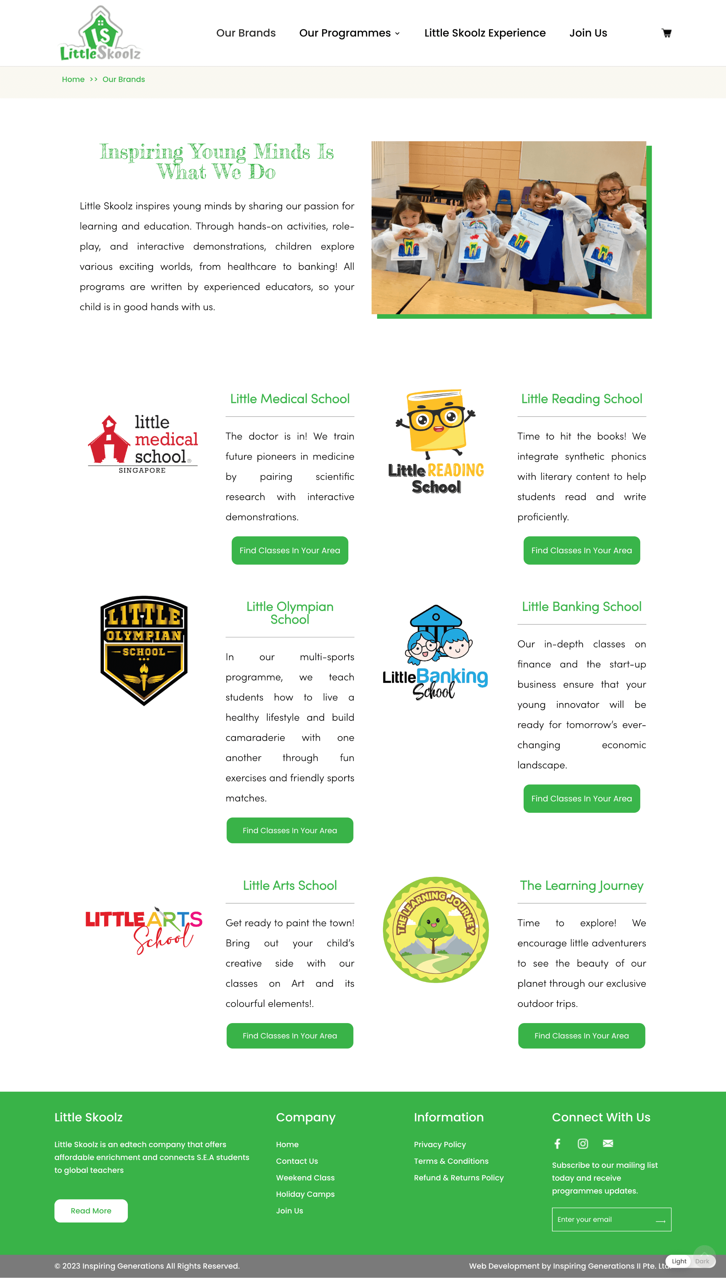
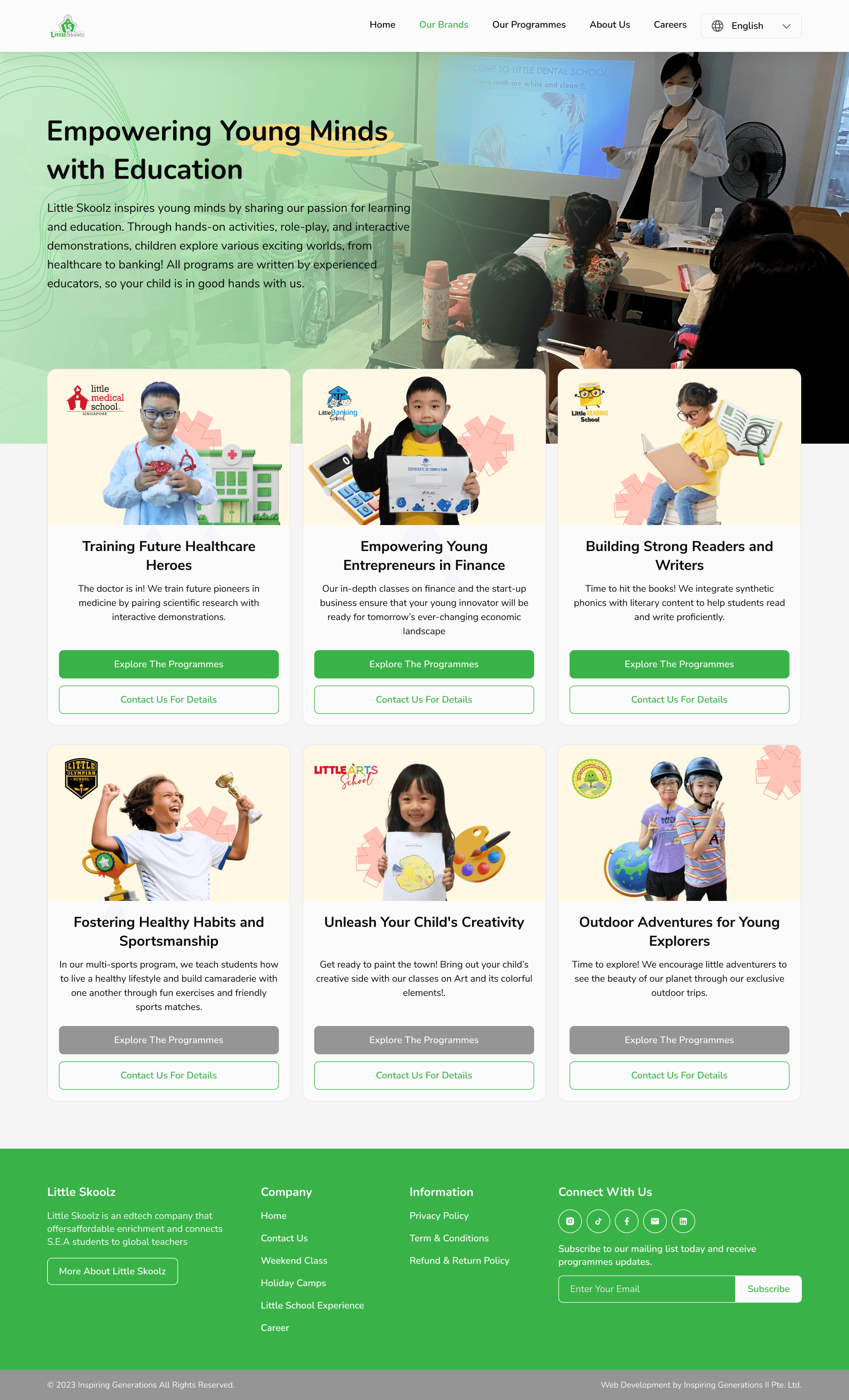
Our Brands Page
Redesigned for a more appealing look by creating a captivating hero section at the beginning with visuals that present a stronger visual identity.
Enhanced the visual appeal of 'Our Brands' cards by incorporating images and 3D illustrations.
Ensured consistent spacing between cards.
Before
After
6
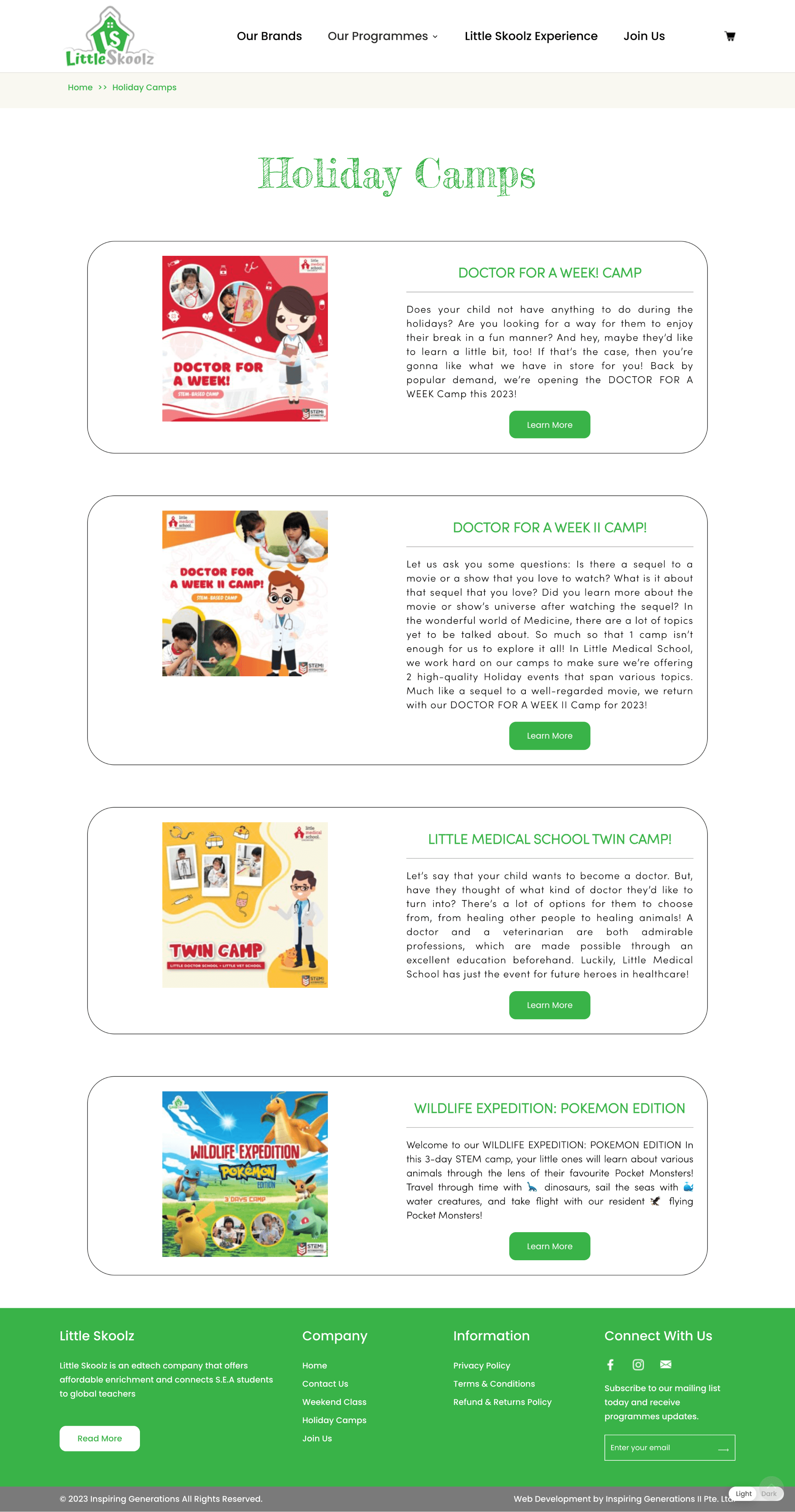
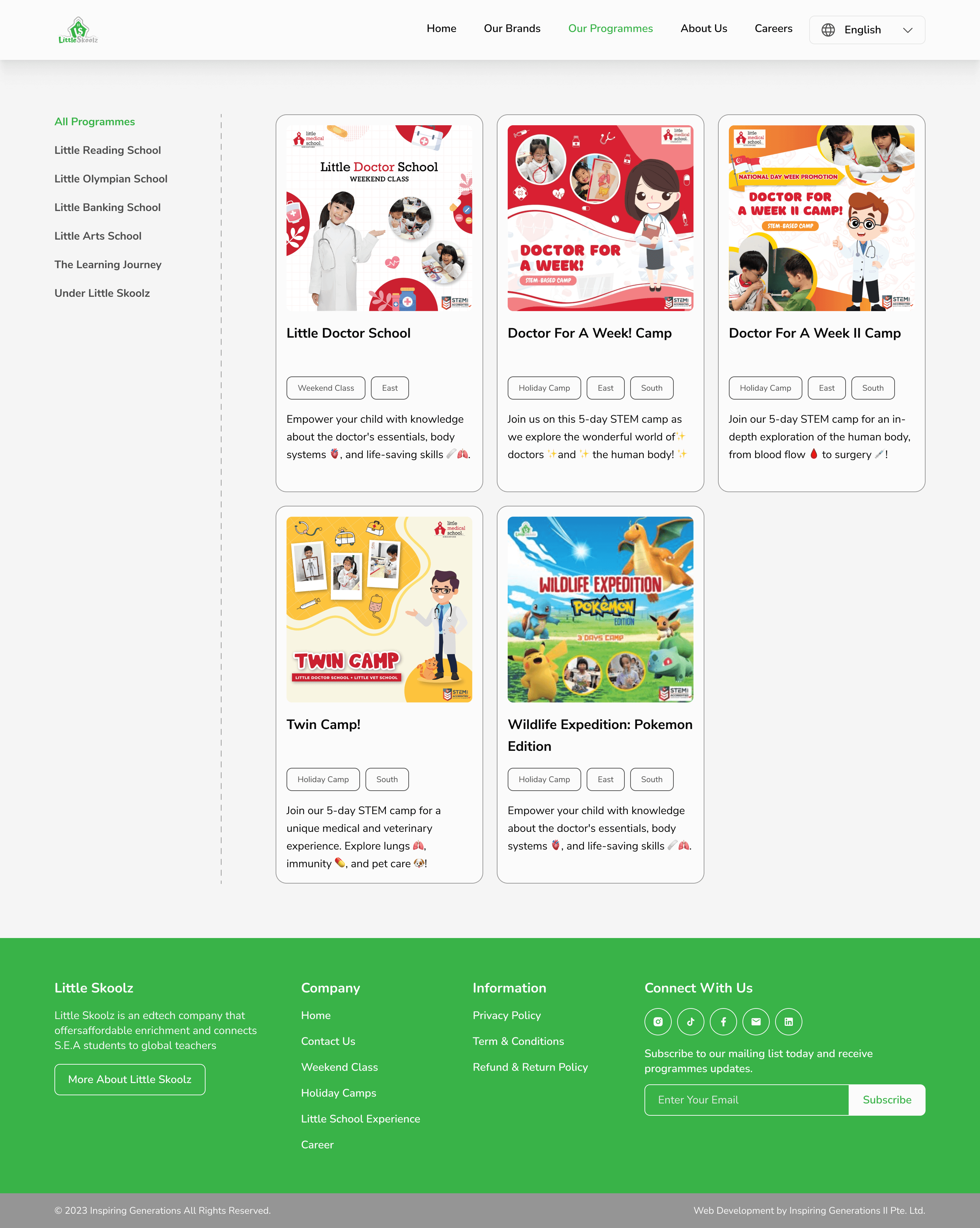
Our Programmes Page
Transformed the Our Programmes card layout to be more minimalistic, reducing excessive scrolling.
Introduced a sidebar for improved program search convenience.
Enhanced card hierarchy for better readability.
8
Note
This first alternative primarily focuses on redesigning the interface, but the program search flow remains lengthy. This alternative solution was developed initially because the CEO wanted to retain the 'Our Brands' page.
Alternative-2
New Design
1
New Our Programmes Page
Creating a search concept for 'Our Programmes' with an overlay that also showcases 'Brands' from Little Skoolz.
Users can directly select from 'Brands,' and then program cards will be displayed.
This is to streamline the user's search process, reducing the need for navigating through multiple pages.
8
Note
The CEO has selected this ideation and solution concept.
3.
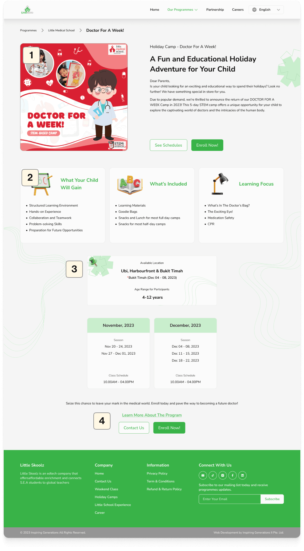
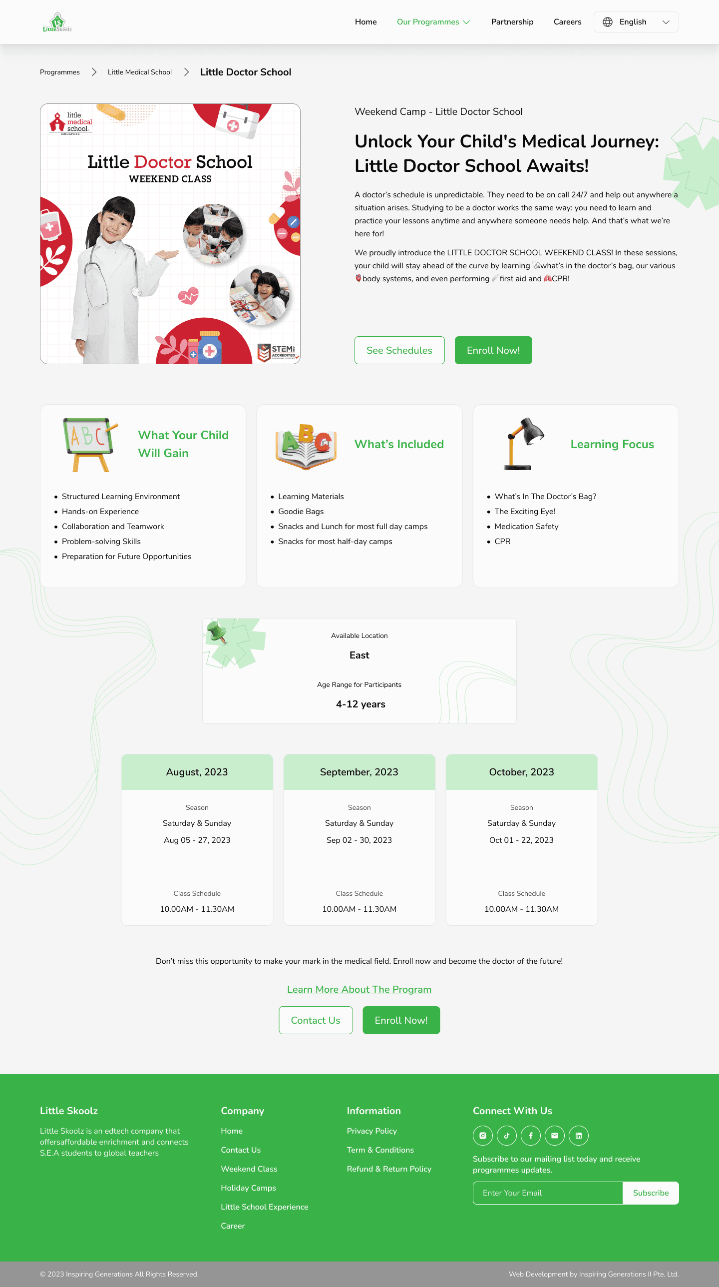
Details Program Page
Before
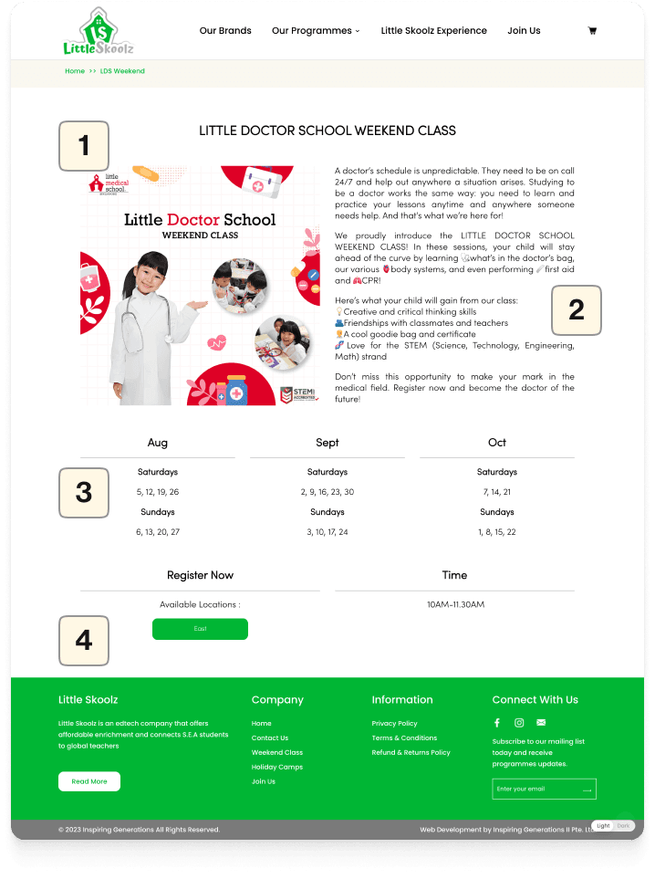
After
1
Improved hierarchy
Reduced program descriptions to concise text, restructured the hierarchy, and added both secondary and primary CTAs for immediate enrollment or schedule viewing.
2
Added supporting points and program benefits
Program details, previously presented as cards with bullet points for user-friendly information retrieval.
3
Revamped the appearance of the schedule and available location information
Restructured the hierarchy of available location information, transforming it from a CTA into a clear card with essential details
4
Enhanced the clarity of the CTA
Revised the CTAs to improve user engagement:
Tertiary: Directs users to the program's dedicated landing page for detailed information.
Secondary: Guides users to contact the admin for inquiries.
Primary: Facilitates registration and leads to the payment page.
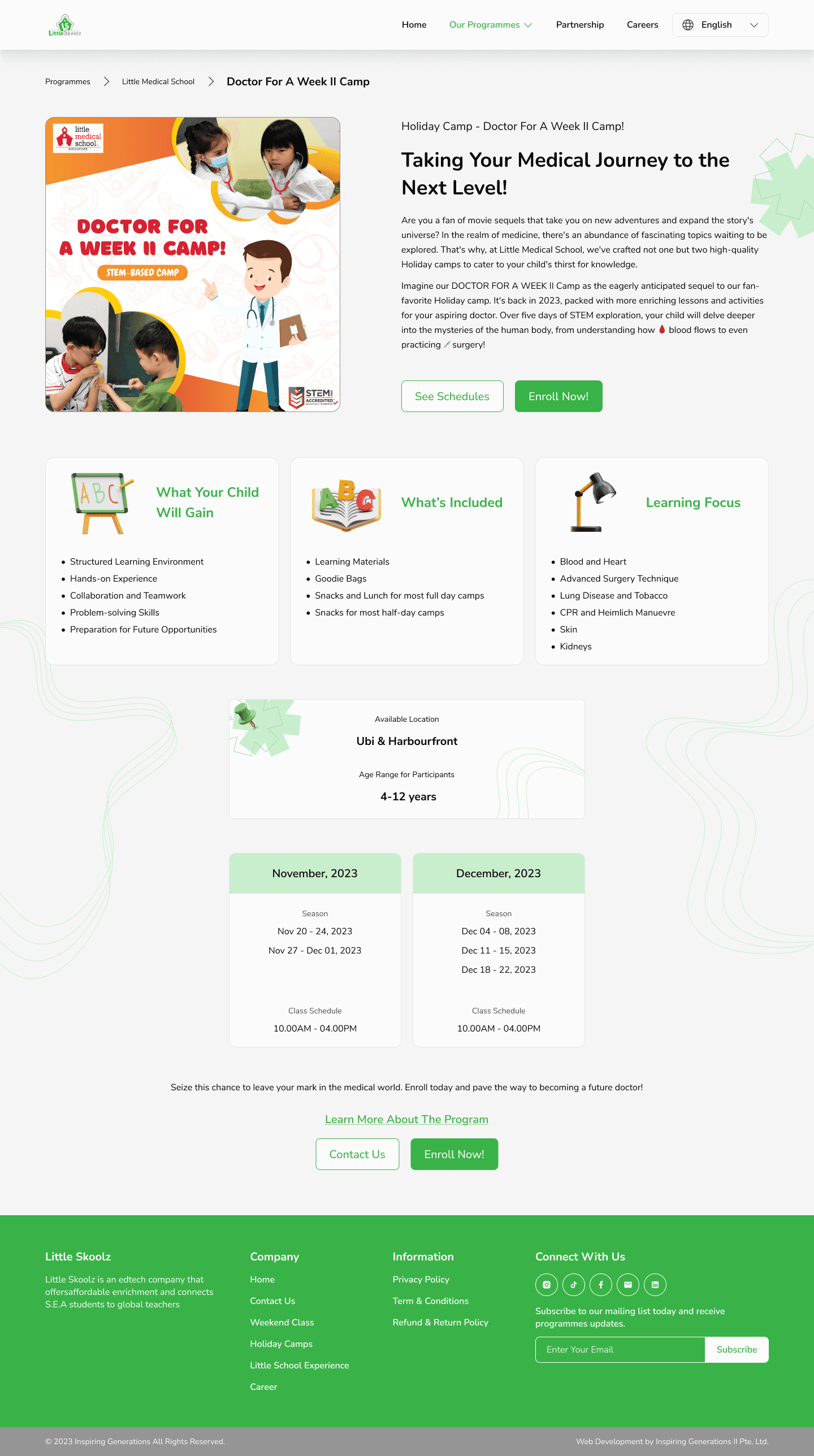
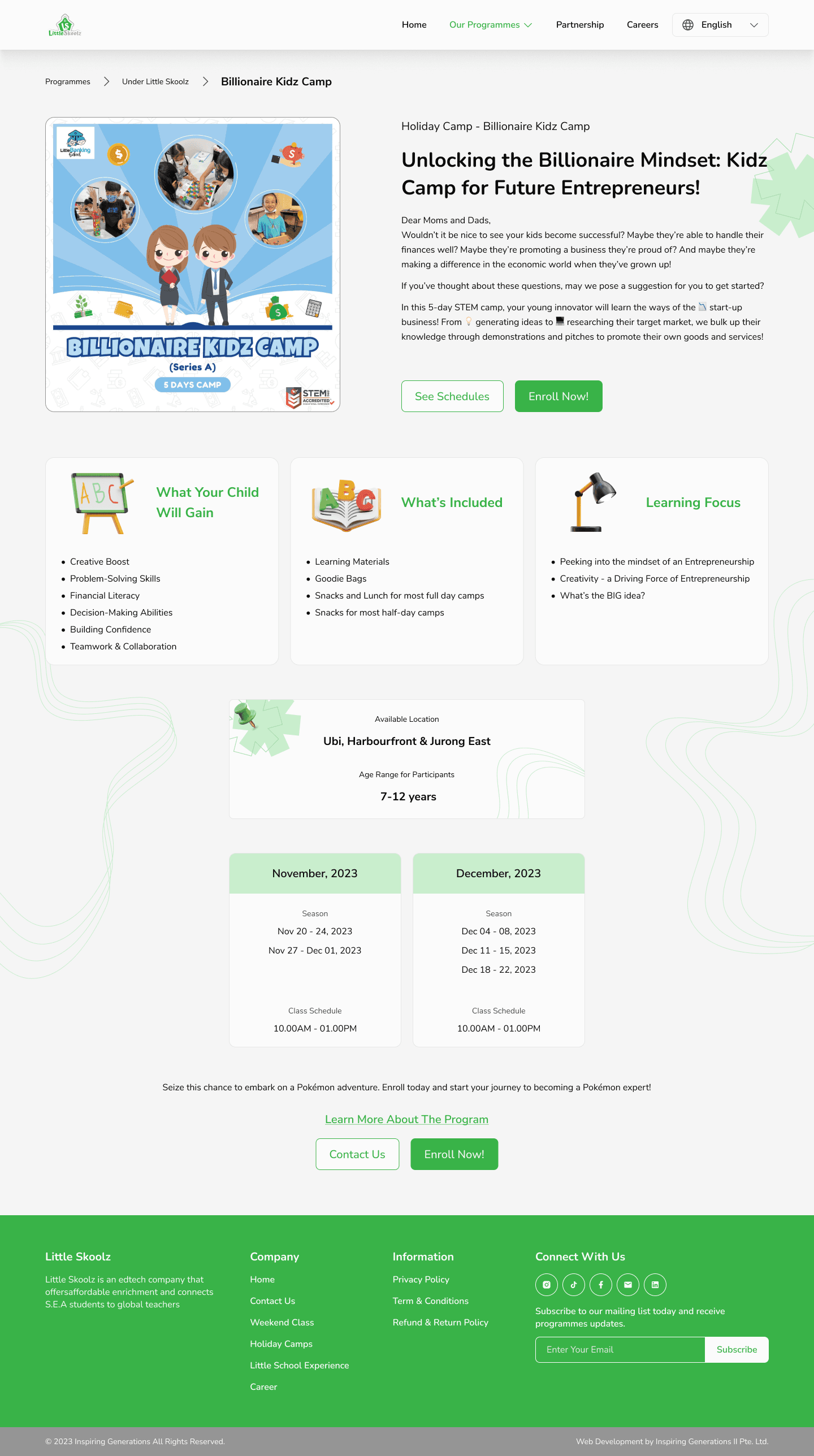
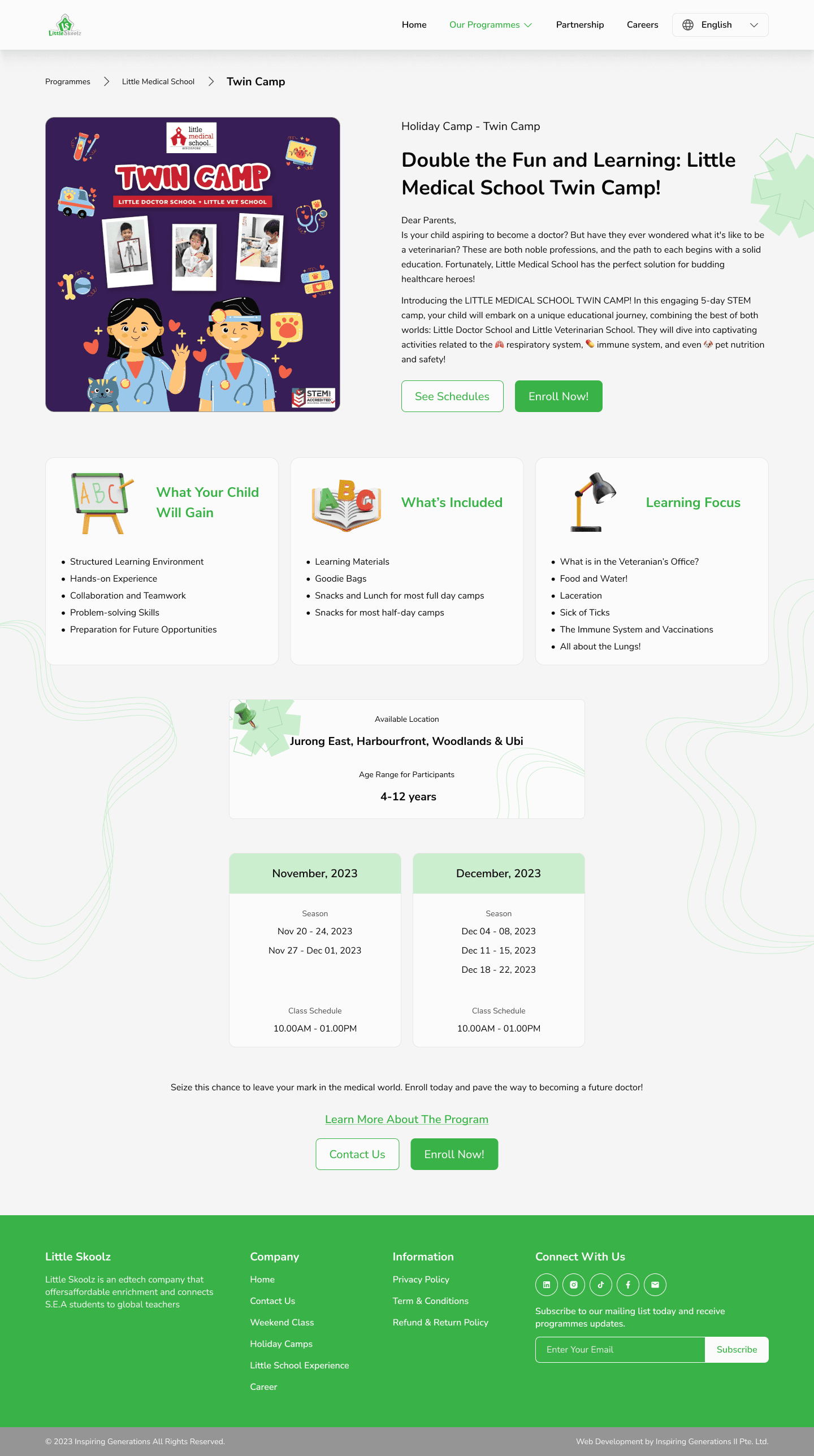
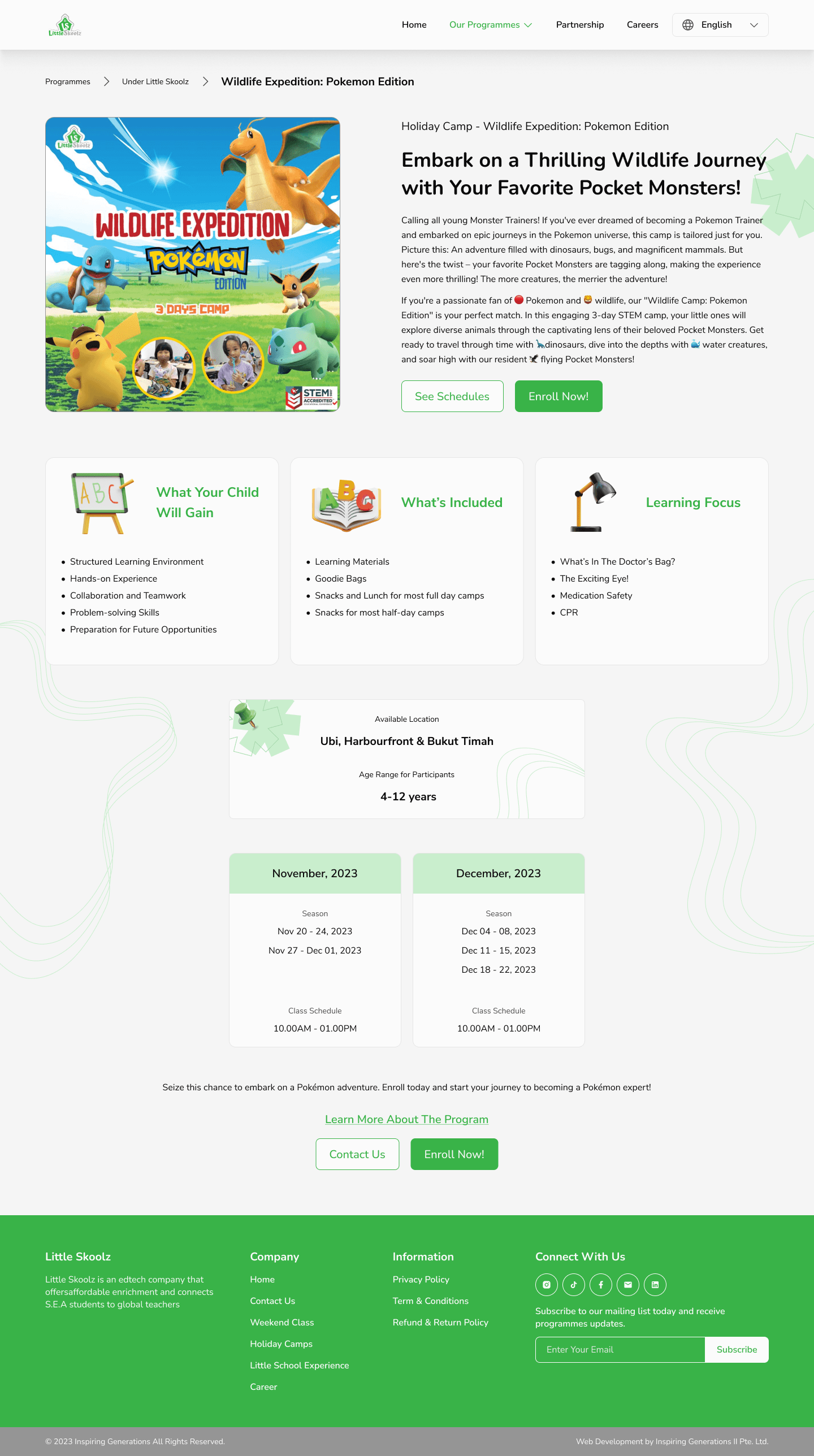
For the "Details Program Page," I've compiled all the ongoing programs to facilitate the IT team in product development. Here's an overview of the Details Program Page I've created:
4.
Partnership Page - New Page
New Design
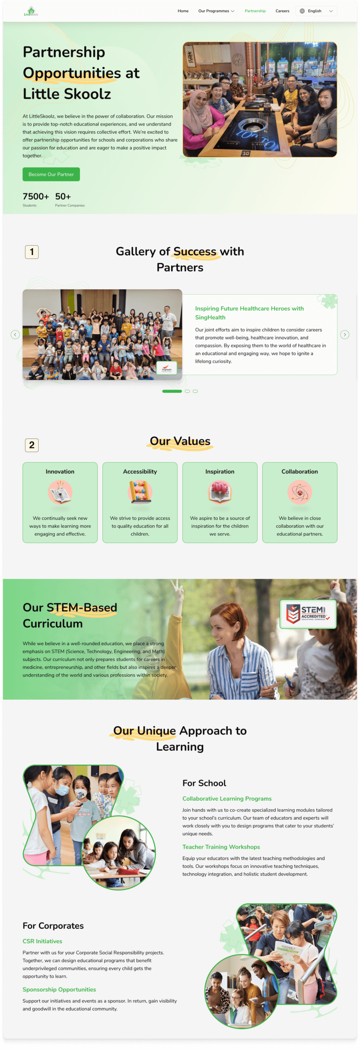
1
Added a gallery section of success with partners to give confidence to potential partners who will join.
2
The value of Little Skoolz is very important to ensure that potential partners share the same values as Little Skoolz.
3
Add sections and information from the Little Skoolz Experience Page
This section and information simply moved from the previous Explore Little Skoolz Experience Page which was removed. By reorganizing the hierarchy and visuals.
4
Add value of partnering with Little Skoolz
Adding information on the value and reasons potential partners should partner with Little Skoolz to convince further and attract collaboration.
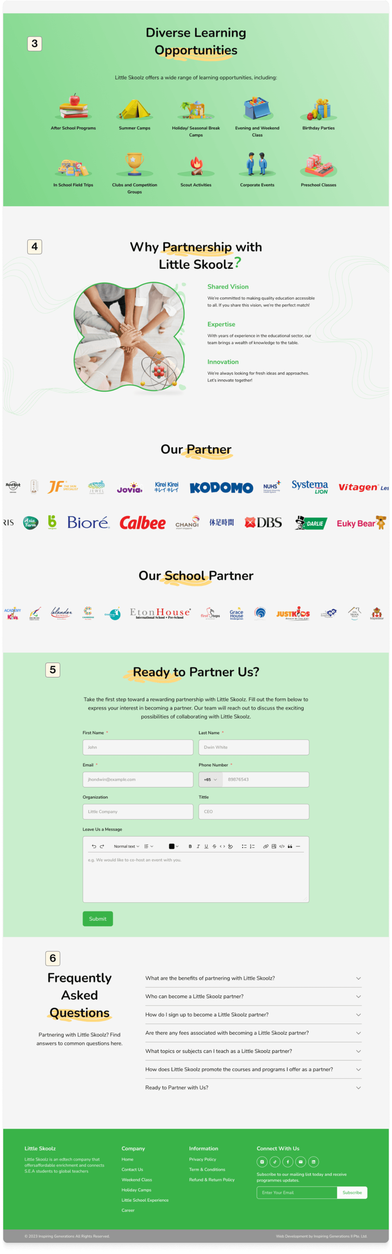
5
Adding a form for partnering
Prospective partners who want to partner with Little Skoolz can directly fill out the form and then submit which will be contacted further by the admin.
6
Adding FAQ for potential Partners
The questions frequently asked by potential partners are here for their initial information and guidance.
5.
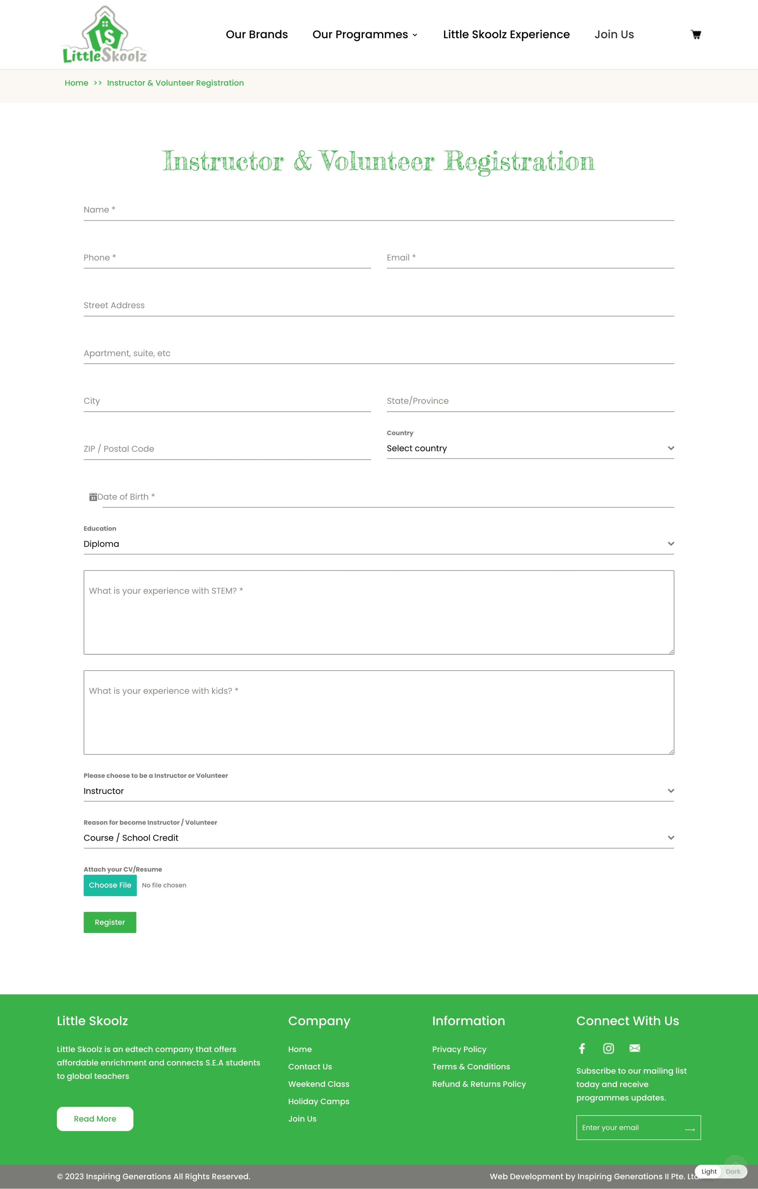
Career Page
On this career page, the CEO asked to keep it the same, because he didn't feel it was too necessary for recruitment. Therefore, I only redesigned the form to be more consistent.
Before
After
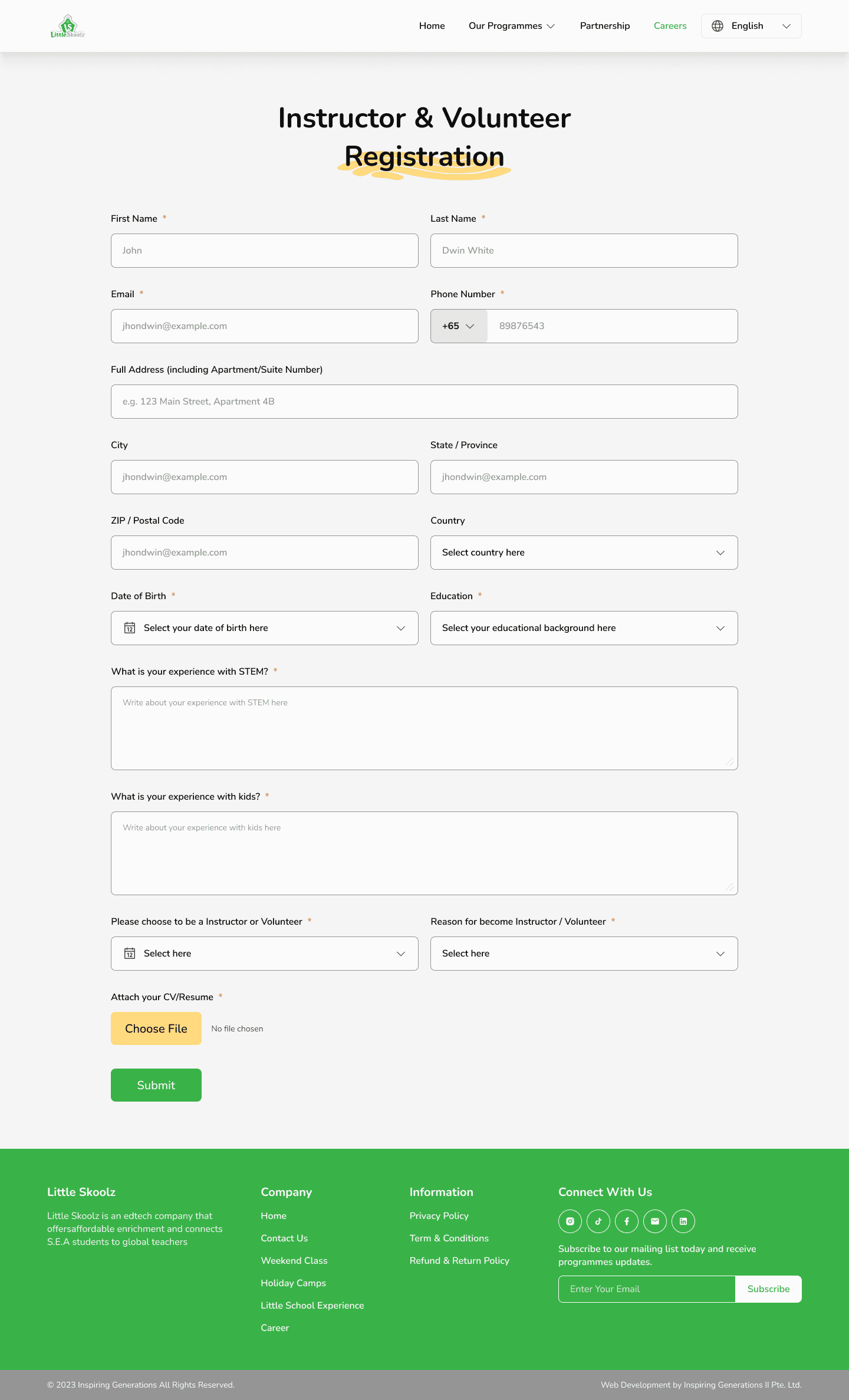
1
Redesign Form
Changes only to the appearance of the form to make consistency in the design that has been made.
Conclusion
What I Learn From Little Skoolz
Recognizing the importance of understanding user behavior, especially in the context of Singaporean users who have distinct preferences in visual aesthetics and a strong inclination towards detailed information consumption.
Learning to navigate the delicate balance between user needs and the CEO's aspirations. This involved creating multiple alternative designs and solutions to facilitate productive discussions.
Being proactive in developing content and information when working with limited input from stakeholders. This required resourcefulness and the ability to fill in the gaps effectively.
Improving communication skills with stakeholders to prevent misunderstandings and ensure alignment on project goals and outcomes.
Disclaimer
The project is still undergoing development and is yet to be fully realized.
While the design concepts have been established, not all of them have been fully implemented due to constraints related to time and technical limitations.
Templates for various programs have been created. However, some components, such as "coming soon" posters or images, are pending final designs from the graphic design team.